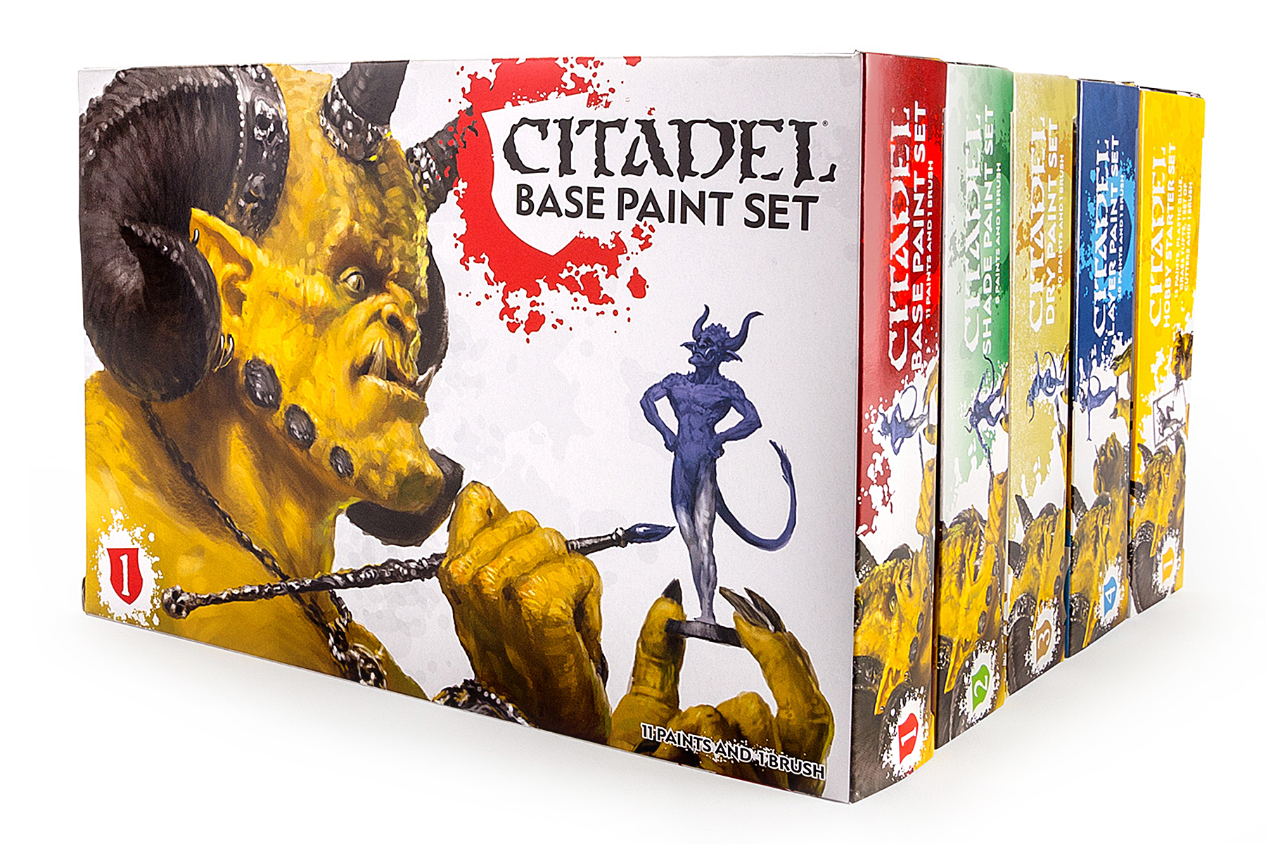
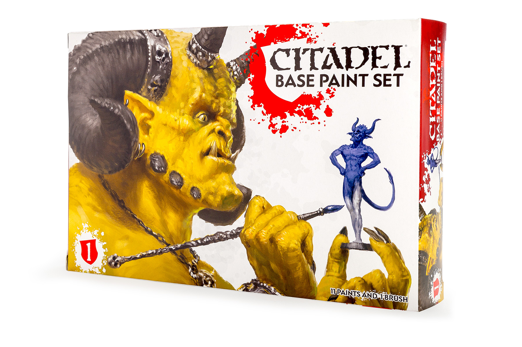
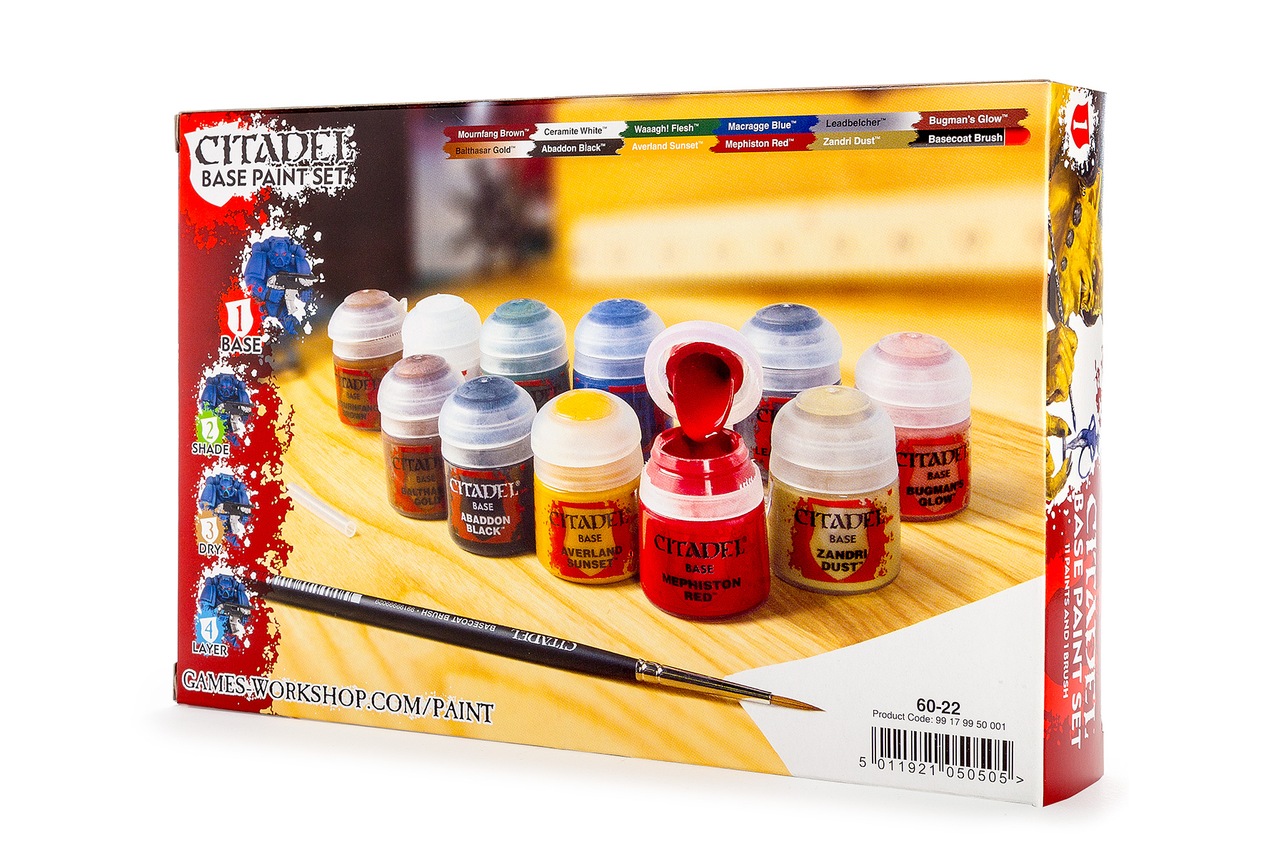
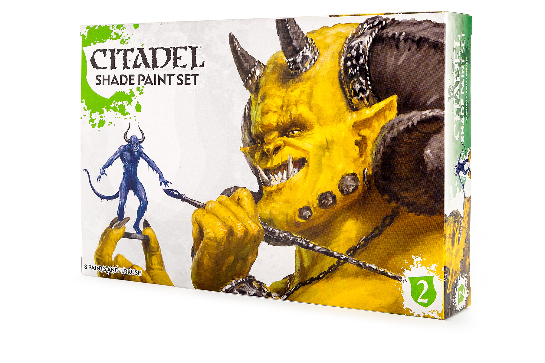
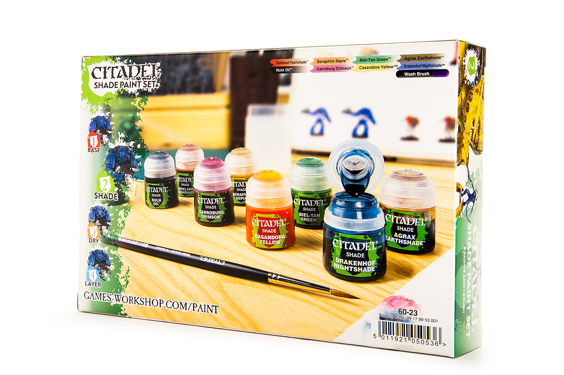
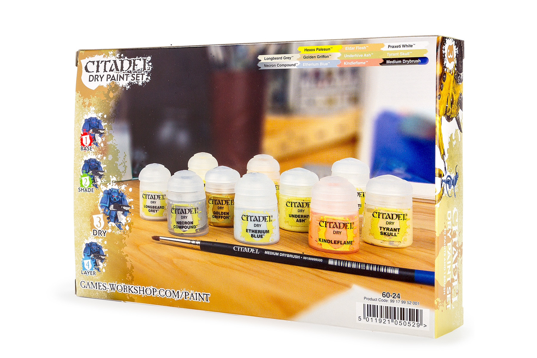
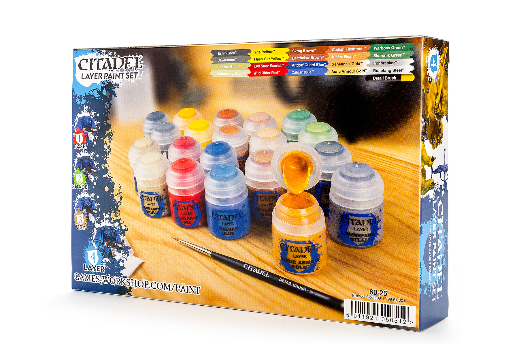
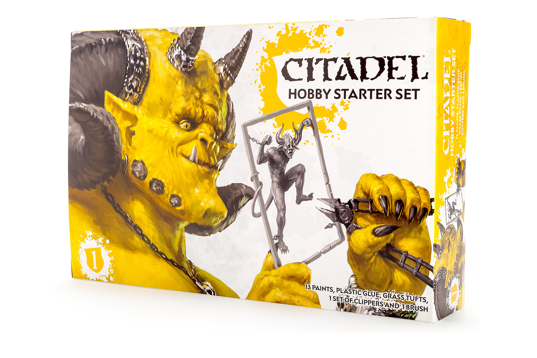
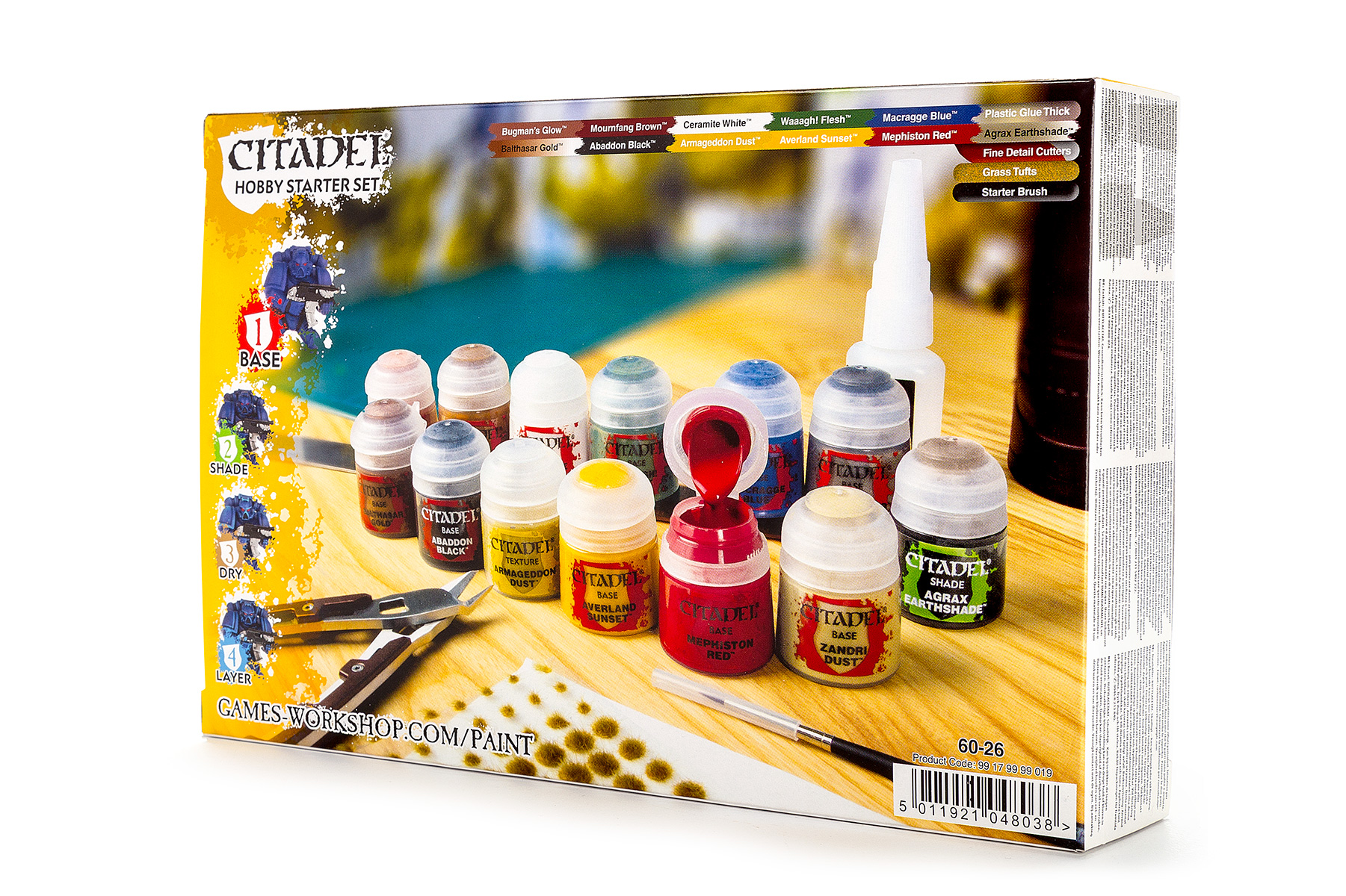
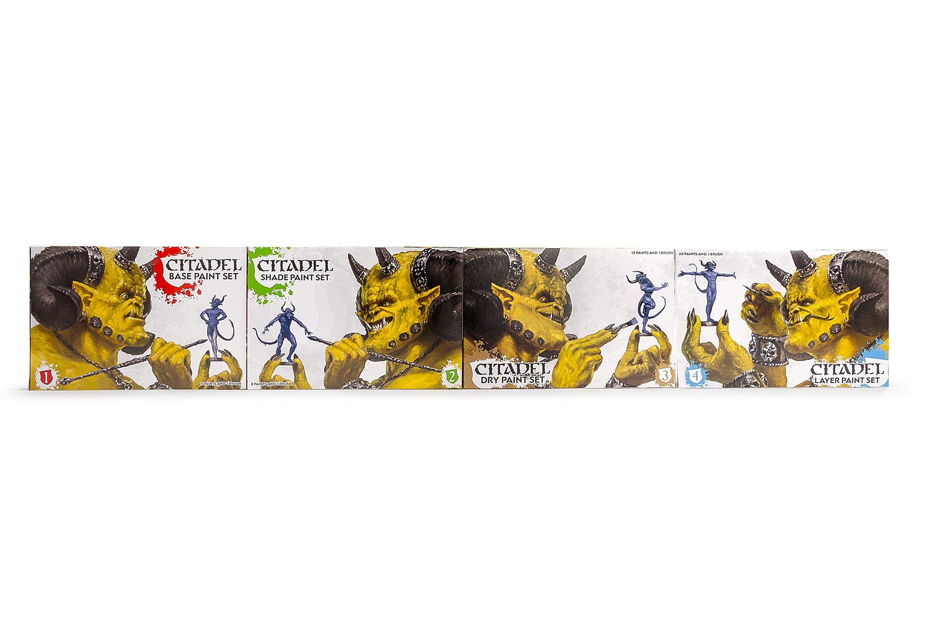
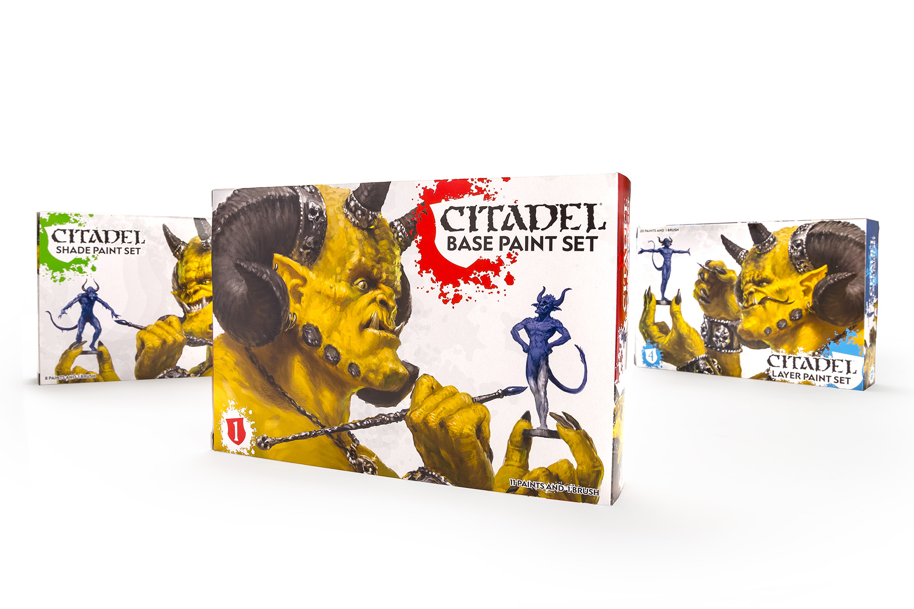
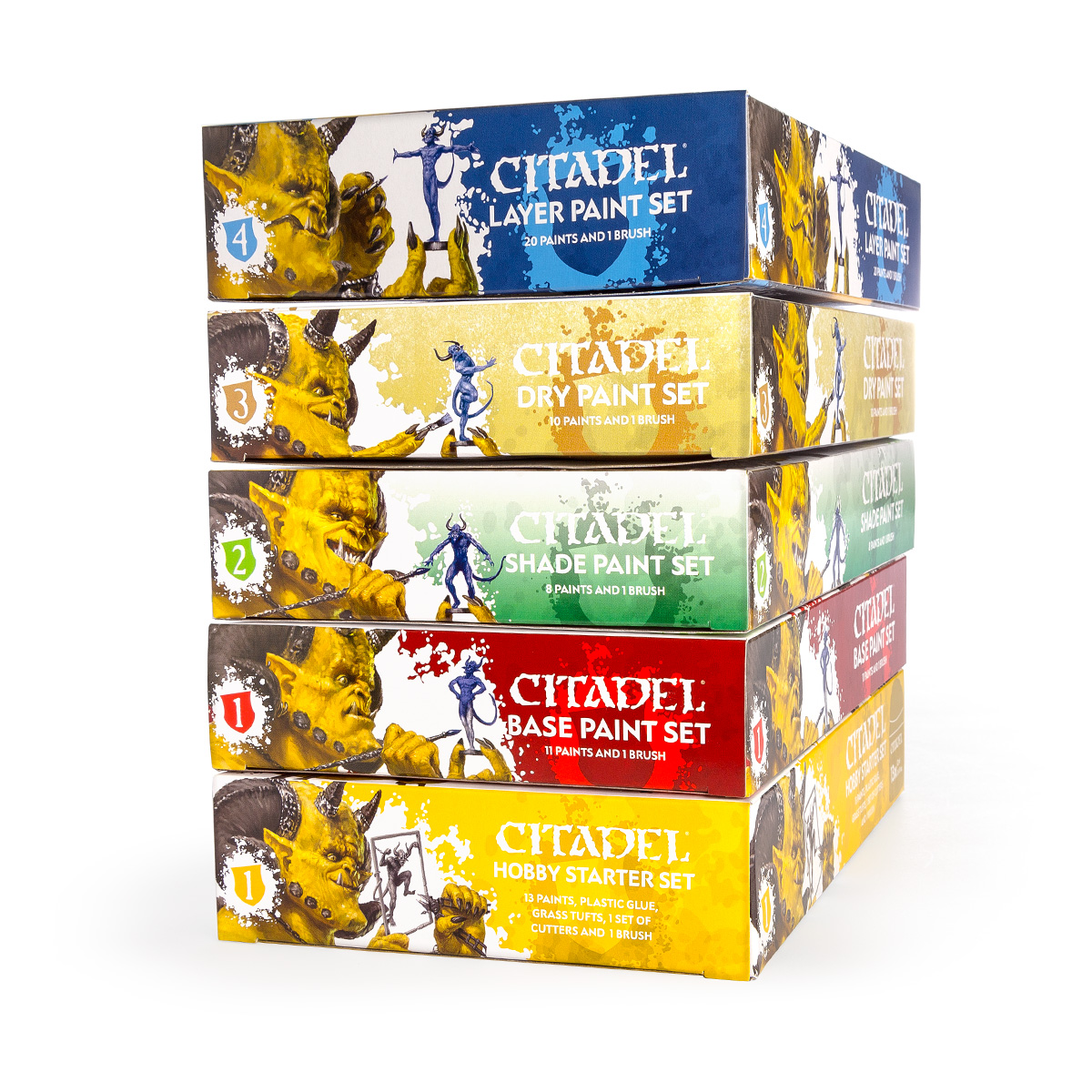
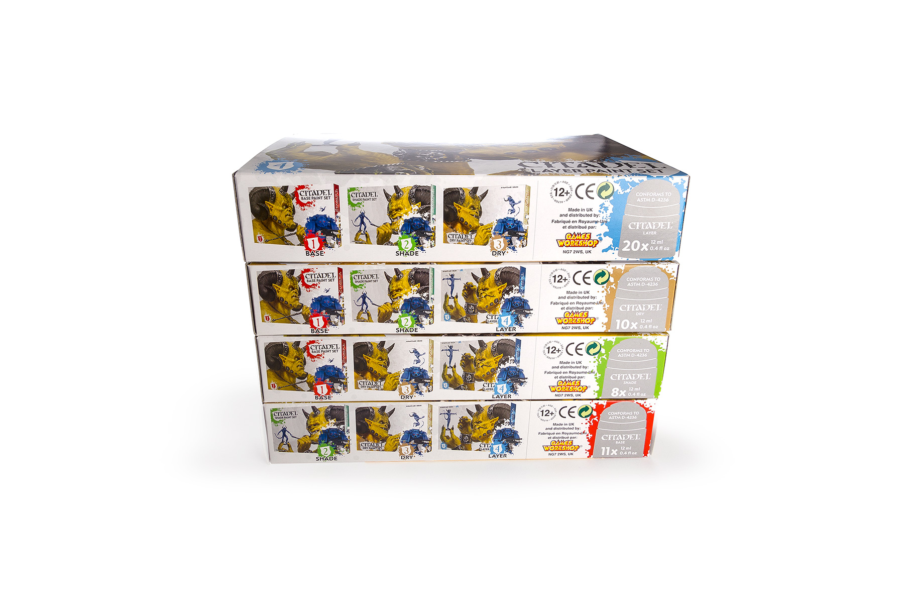
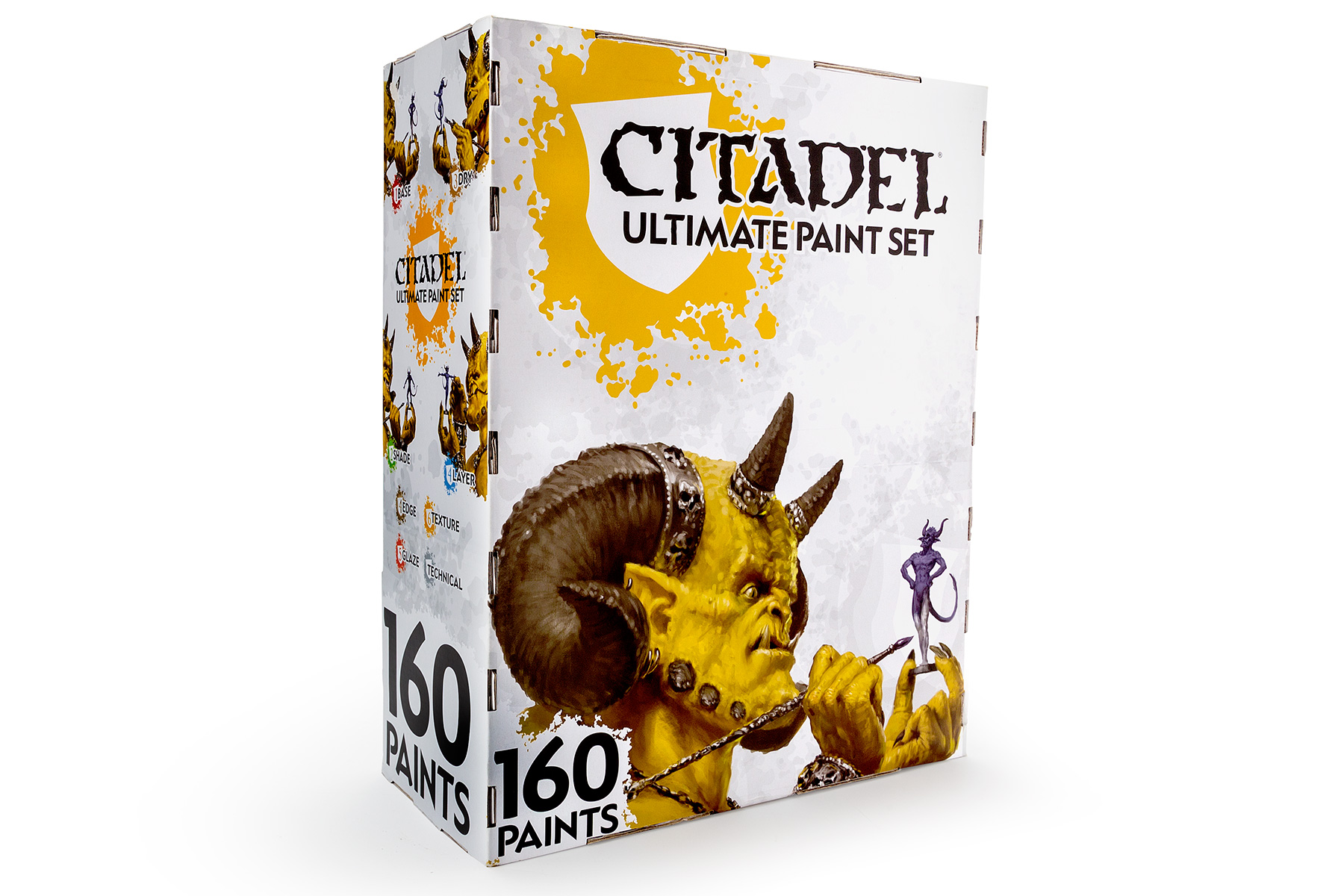
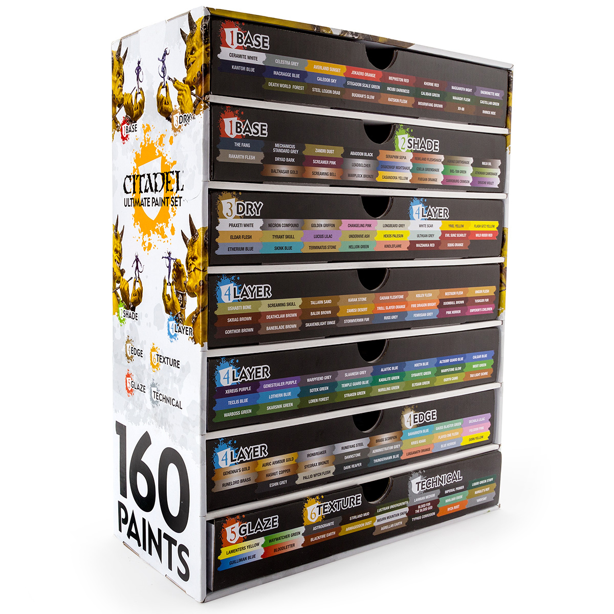
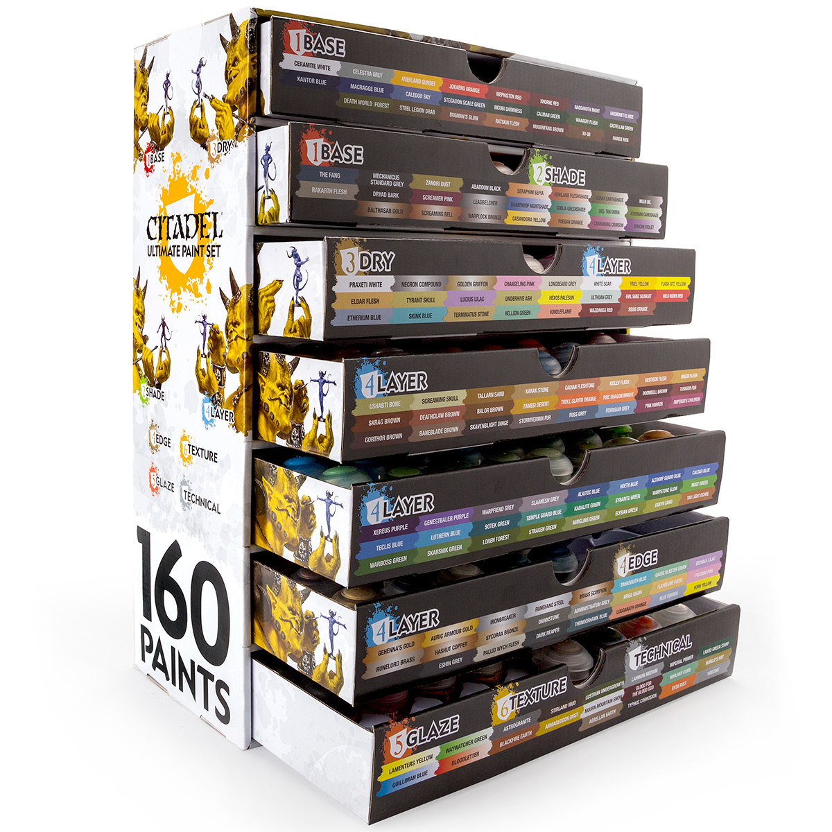
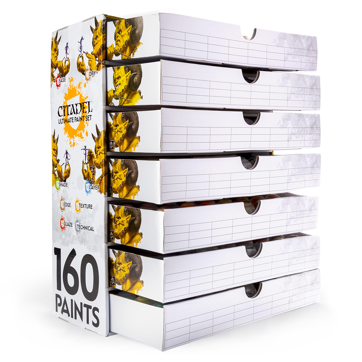
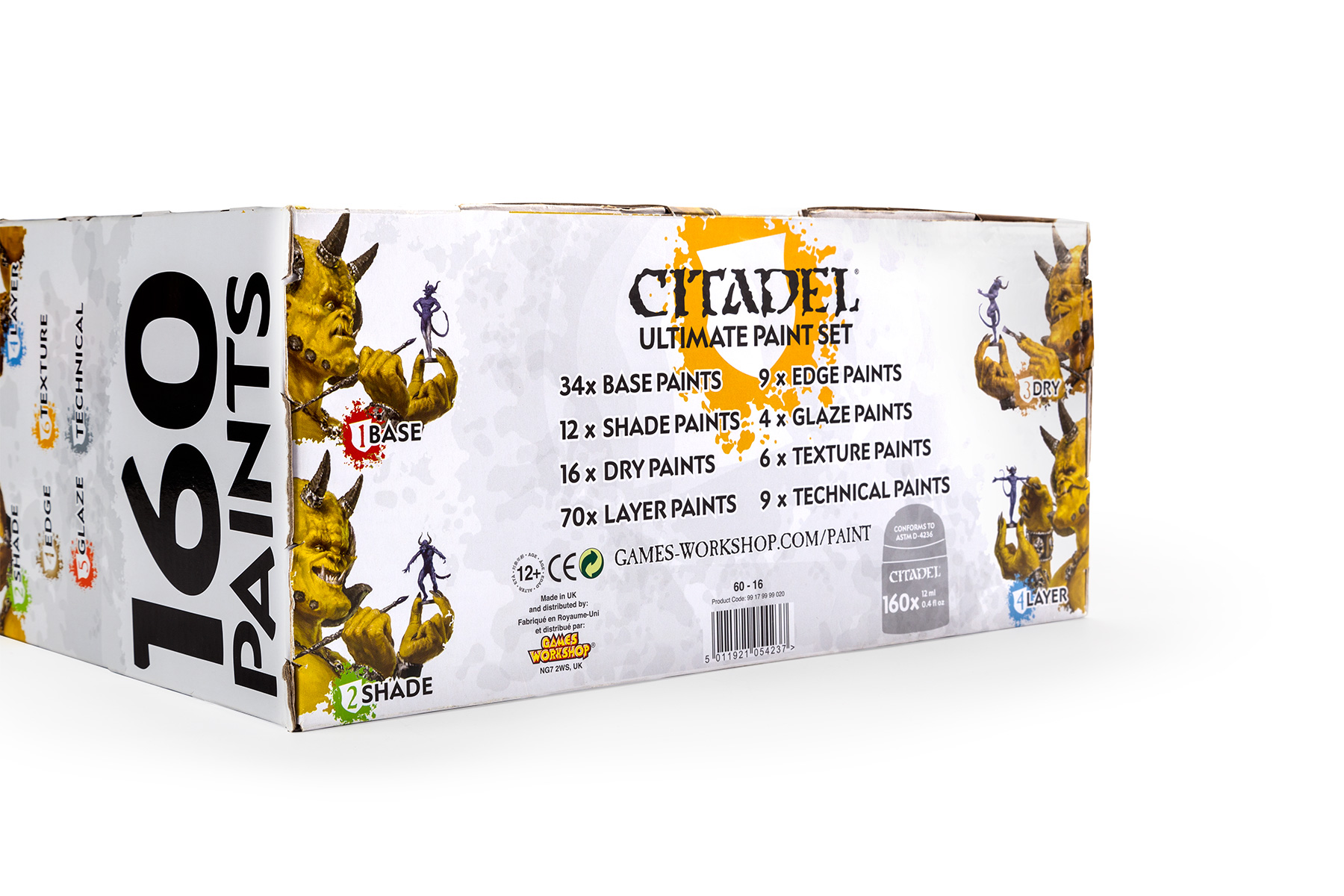
Leigh Woosey Design


Gallery Direction Arrow

Citadel Paint Sets
Citadel Paint Set range, developing the Citadel Paint brand, reintroducing the yellow demon as brand ambassador and developing a faster method of introducing new customers to the painting hobby.

Citadel brand paint sets stacked together showing a range of colours and the yellow demon mascot. The front of the Citadel Base Paint Set. The interaction between the yellow demon and the blue sidekick demonstrates the hobby function and USP of the set. The back of the Citadel Base Paint Set. A new style of product photography for the company was developed to provide an attractive scene to sell the contents. The front of the Citadel Shade Paint Set. Mooodboards and references were provided to the illustrators to create a consistent characterisation to the brand mascots. The back of the Citadel Shade Paint Set. each set has a number which keys to their use in painting Citadel models. The front of the Citadel Dry Paint Set. Humour was deployed to increase consumer recruitement by making the hobby friendly and approachable. The back of the Citadel Dry Paint Set. Shallow depth of field and careful composition in the photography promoted the contents as never before. The front of the Citadel Layer Paint Set. The layer set was the last set in the painting process and so was represented as the crowing achaivement of the mascots on the front panel. The back of the Citadel Layer Paint Set. The left section of the panel offers a quick painting lesson to promote the other sets. The front of the Citadel Hobby Starter Set. This set included tools and glues and could be promoted with or apart from the other boxes. The back of the Citadel Hobby Starter Set. Citadel paint sets together, from the front. The artwork on the front of the boxes was composed to form a narrative when desplayed on the shelf. A selection of the Citadel paint set boxes, showing the unity and branding across the range. The colour coding of the sets helps promote them in crowded third-party retail stores. The base panels of the Citadel paint sets. Information on this panel promotes other sets in the range and encourages multiple purchases. The Citadel Palette Pad. a disposable painting palette. The Citadel Ultimate Paint Set, seen here from the front, contained the whole paint range in a limited release, 39cm tall box. The back of the Citadel Ultimate Paint Set held seven sliding drawers. The paints were packed precisely according to frequency of use. The Citadel Ultimate Paint Set drawers opened, showing the box construction. The drawers on the The Citadel Ultimate Paint Set could be reversed and customised. Stickers and spare spaces were provided so consumers could rearrange or add to their collection. The The Citadel Ultimate Paint Set tended to be stacked on high shelves, so these side panels promoted the USP clearly near the base. Each panel, such as this base, carried useful information to promote the product. The top panel of The Citadel Ultimate Paint Set, reusing assets from the main paint range. Downloadable guidance leaflets, created for each of the paint sets and made freely available alongside video tutorials. The Citadel Paint leaflets shown here together. The leaflets carriend the paint branding and could be downloaded to a variety of tablets or printed out and folded for in-store POS support. Detail of the novel product phpotography style devbeloped for the back of the paint set boxes.


Gallery Direction Arrow

Citadel Paint Accessories
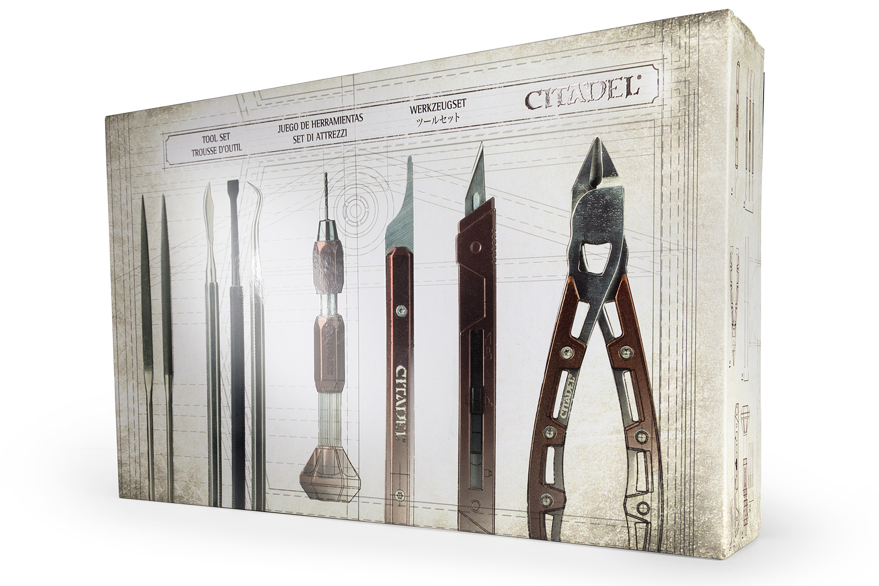
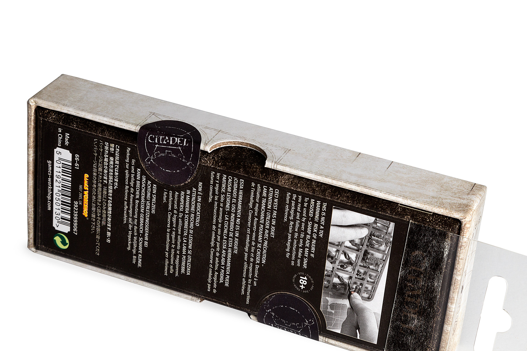
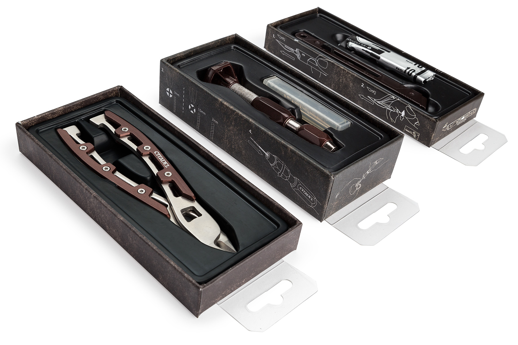
A range of complimentary products including a belly-band for the Citadel Project Box, with bespoke product photography and infographics. Each product educate customers and provides shelf presence in a crowded and varied sales environment.

The collectable Citadel Waterpot, and its Bitzbox packaging. The inital launch range of the Citadel Waterpots, the tin boxes sealed shut by adhesive labels. Citadel Waterpot and Bitzbox sets, the outer packaging was colour-keyed to the mug inside. The front panel of a Citadel Waterpot and Bitzbox set. The devilish smile of the mascot hints at the joke - that the 'waterpot' is a collectable mug. Oblique view of the back panel of the Citadel Waterpot and Bitzbox. Product photography attractively demonstrates the contents. Oblique view of the front panel of the Citadel Waterpot and Bitzbox. Face-on view of the back panel of the Citadel Waterpot and Bitzbox. Back panels of the Citadel Waterpot and Bitzbox. Consistency across the product photography enchances collectablity of the range. The Citadel Bitzbox without sticker, showing how each surface of the box and lid is embossed with the Citadel shield, making the brand image a permant feature of the collectors hobby space. The belly-band wrapping the Citadel Project Box, showing the die-cut that makes the embossed detail visible to the consumer. The back of the Citadel Project Box wrap, showing bespoke product photography and diagrammtic instructional images to educate the consumer and promote the product USP. The top panel of the Citadel Project Box wrap. on each panel product photography promotes the different configurations of the product. Detail of the base panel of the Citadel Project Box wrap, showing its storage function in an idealised hobby environment.


Gallery Direction Arrow

Citadel Tools Range
The Citadel Tools range was rebranded with premium rigid box designs, including safety instructions and accompanying point of sale and web graphics. Finished with spot gloss varnish. Launched to great success and acclaim.

The Citadel Tools range together, in premium rigid box packaging. The Citadel Drill box front, highlighting the product with a spot gloss varnish. The Citadel Fine Detail Cutters box front, highlighting the product with a spot gloss varnish. A visual language of construction lines and engineering scales convey the high prescision and machined quality of the tools. The Citadel Knife box front, highlighting the product with a spot gloss varnish. The Citadel Mouldline Remover box front, highlighting the product with a spot gloss varnish, as are the brand wordmarks. The Citadel Sculpting Tool Set box front, highlighting the product with a spot gloss varnish. A clear adhesive euroslot hanger maintains the prescision feel with chamfered corners. The Citadel Files Set box front, highlighting the product with a spot gloss varnish. Despite varying heights of the products keys elements keep a consistent eye-line when hung. The Citadel Knife box back panel. The rear panel demonstrates keys safety information with duotone photography. A collected edition of the Citadel Tool Range. The top and side panels give additional contents information with linework illustrations. Details of the adhesive paper secureity seals that lock each box. As shown here, the paper seals must by satisfyingly broken to open each box. Opened Citadel Tools boxes, showing additional instrucions on the base panels that are revealed as the consumer opens the product. The front of the Citadel Cutting Mat  packaging, designed to accompany the tools. Detail of the Citadel Cutting mat being opened. The Citadel Cutting Mat, featuring angles, measurments and scales designed specifically for a hobbyist's needs. The Citadel Cutting Mat, showing how it compliments the rest of the tools range. A brand language was created for the range and supplied as an asset pack and brand guide to be applied across multiple touch points including web, video and POS. Citadel Tools Shadowboard POS units, produced in multiple languges for different territories.


Gallery Direction Arrow

Warhammer 40,000
Developing new photography styles to communicate each toy set's USP within an existing brand format.

The existing brand style had to be adapted to new formats and shelf placement. Forced perspective photography exentuates the product on the primary face panel. Architectural views describe the scale and details for the consumer on the rear panel The left side panel shows the product at full scale. On the right panel the rotating turret feature is shown. The top panel carries the consumer over to the back of product, extending constumer interaction. The font panel shows one of the many configuration of this toy. Imagery on the back panel makes the box conents and toy scale explicit. The toy set is shown in action in a birds-eye view on the primary panel More detail and the components of the set can be seen clearly on the back panel. Each back panel contains relevant contents and infographics to aid the consumer.


Gallery Direction Arrow

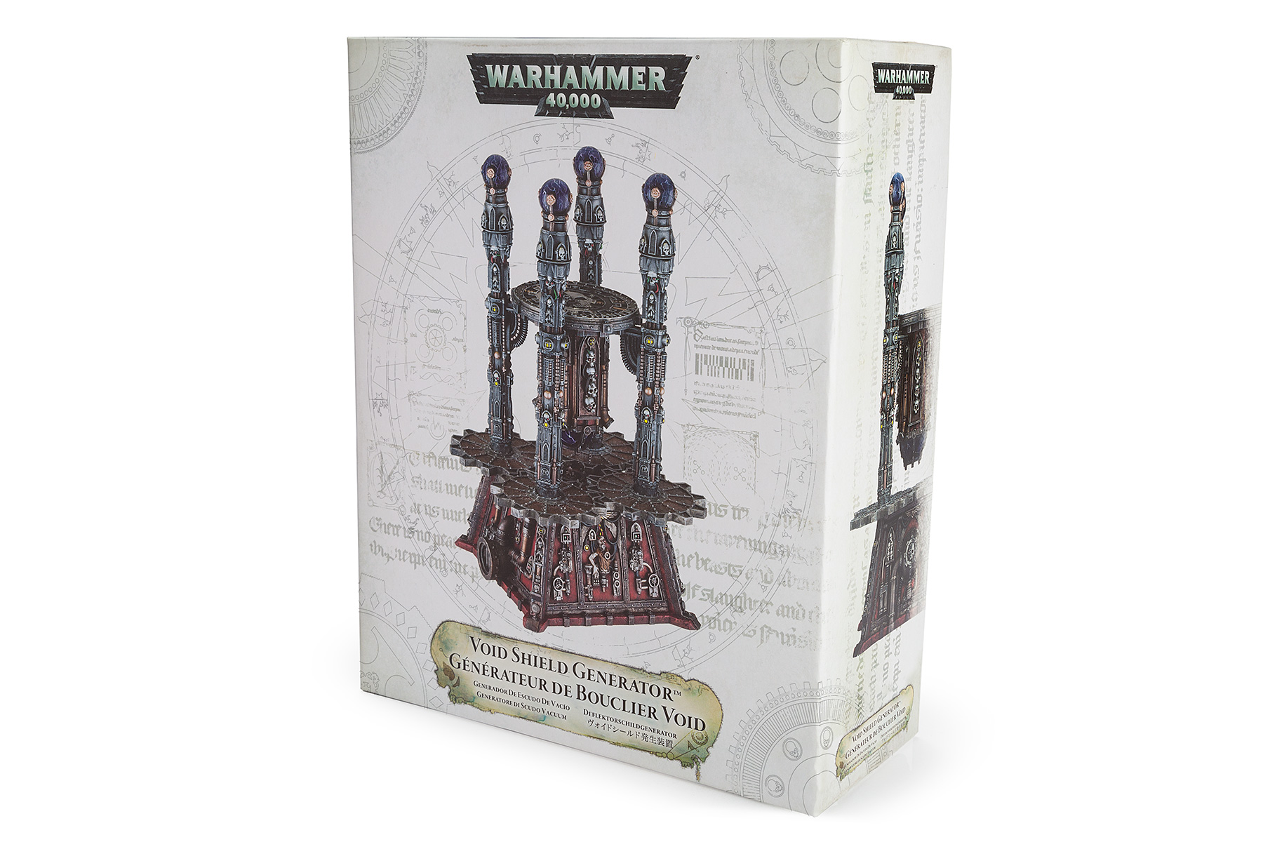
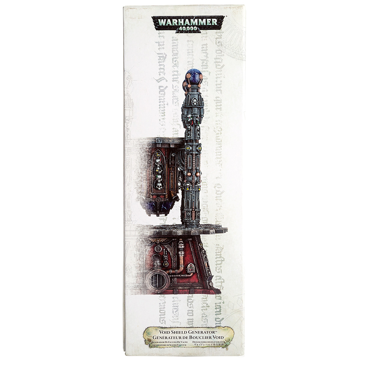
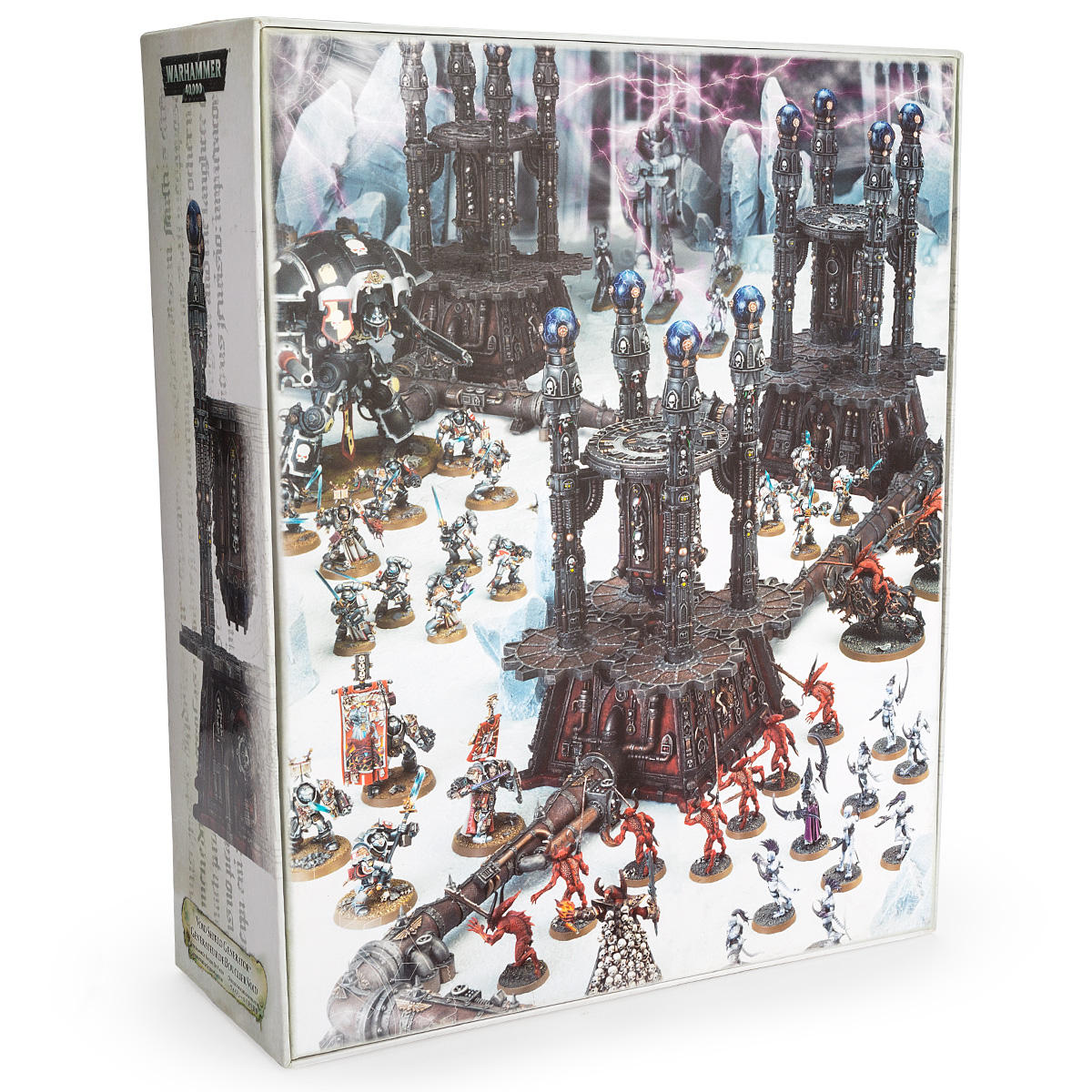
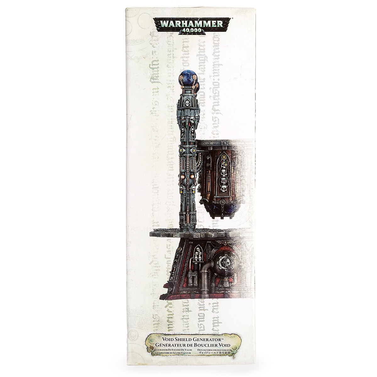
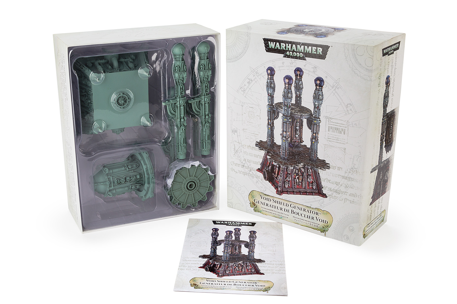
Void Shield Generator
Premium, limited edition, Warhammer 40,000 packaging – individually numbered and the result of close collaboration with buyers, suppliers and printers. This product sold out online within an hour of  launch.

Mystical text and arcane diagrams representing the space-fantasy setting were created to embellish the front of the box. The product shots on the front and side panels were picked out in UV spot gloss varnish, adding depth and visual appeal. The back panel of the box is an action-packed scene demonstrating how the product can be combined with others in the range. The side panels offer a one-to-one scale representation of the product, fading into an arcane illustration. The arcane stylings continue as the box is opened, revealing the assembly instructions. The boxes were individually numbered on the top panel, by hand, in a specified script. ALT Carefully layered vacuum-formed trays, tissues and contents ensured that each level of unboxing would surprise and delight. ALT A rules booklet was presented in multiple languages, for use in the Warhammer games. The product shot places the set at the centre of the war-torn universe of Warhammer 40,000.


Gallery Direction Arrow

Warhammer
Age of Sigmar

Scenery packaging for which I developed new styles of product photography for the company. This evolved the brand to support a new product range, which became the most successful Warhammer scenery launch to date.

The Warhammer Age of Sigmar scenery style enables the range to stand together no matter their shelf arrangement. The new primary panel product photography featured low angles to present the scenery pieces as aspirational objects The back panel of this set shows the new system of paint recipes, collaboratively developed to increase sales by aiding the consumer journey in-store. Each front panel photograph features heroic warriors in mortal combat over the scenery pieces. The rear panel product photography for the heroic scenery features coloured rimlights to suggest magical power. Mountainous terrain was digitally rendered for the primary panels to suggest the import of each set. Box outs on the rear panels make the contents of each box clear to the consumer. The primary panel of the Dragonfate Dias box makes the scale and play features of set apparent through an exciting narrative. Each scenery piece is the centre of a gaming scene in the back panel shot, placing the product in the context of collecting and brand engagement. Safety information is presented next to detail shots on the closure panel, meanwhile a specially-designed locking tab removes the need for shrink-wrapping. A special sub-brand was designed for the scenery of the villainous Chaos faction, aiding retailers and encouraging collecting. Red highlights and interior lighting add an air of malevolence to the primary panel photography of the evil fortress sets. The side and top panels of each box highlight an enticing feature of their sets. Smoke machines, custom-built scenery and digital work combine to make the back panel shots a dramatic and detailed introduction to the fantsy setting. The opening gate features of the Malefic Gate set were strongly emphaisied on this primary panel. Each back panel shot for the evil fortress presented an alternative view of the product while demonstrating the USP of each set. Lightning decoration frames the imposing primary panel shots and adds drama to the packaging style. Each back panel shot shows the product as a worth centre-piece of a consumer's Warhammer colection. The left side panels of each kit stack together to form an exciting battle scene, providing a Point-of-Sale display at no extra cost. Every panel plays a role in demonstrating some sales feature of the kits. The left side panels of each kit prodide a book-shelf effect, showing key features of each kit at full size while saving shelf space. The product shots are carefully staged and precisely lit to bring the fantasy and drama to life. The evil fortress product shots contrast with their heroic countparts with fiery tones. Deep perspective draws the consumer into the fantasy setting in the rear product shots. The heroic scenery sets have a magical glow to them. Construction booklets were prepared for each kit, making the assembly process straight-foward and rewarding. Each step of the assembly process was broken down and made clear, even for beginners. The construction booklets were also an opportunity to show assembly options and ways to combine kits and increase up-selling opportunities.


Gallery Direction Arrow

Warhammer
Age of Sigmar

Tabletop gaming accessory packaging. This project developed an existing brand language to fit a new product range, featuring stylised product photography.

Warhammer Age of Sigmar dice displayed in window boxes, in good and evil versions. The window box of the measuring tool enables the high-quality metal to be seen by the consumer. Stylised photography communicates the use of the measuring tool while being in-keeping with the brand values. Eldritch text and faded imagery conveys the high-fantasy setting core to the Warhammer Age of Sigmar brand. The premium metal tape measure is displayed in a sturdy window box. The packaging carries the brand style, highlighting the product inside. Instructional graphics and photography render the use of the product in a way that compliments the overall design on the rear panel Key measurements for the Warhammer Age of Sigmar game are highlighted with bespoke stylised decoration on the tapemeasure. Faction-specific collectible dice and shakers accompanied the launch of Warhammer Age of Sigmar Stylised photography demonstrates the use and storage of the dice shakers. The chaotic faction dice set benefited from a darker, corrupted version of the heroic design. Hidden text in gold added more for consumers to discover and engage with in the packging. The dice boxes were consistent in layout, but differed in details between the good and evil versions. The top panels show the different formats of the dice window boxes.